ISSA Proceedings 2010 – Rhetorical Figures And Their Chances In Hybrid Media
 1. Visual and verbal communication
The study of rhetoric is generally restricted to verbal communication. The art of rhetoric found its origin in the oratory, evidently so, and it is assumed that treatises on rhetoric mainly presented advice on the writing of appealing speeches that convince their audiences. However, those assumptions tend to neglect the fact that rhetoric treatises did not only handle the inventing and writing of speeches, but also the delivery. The attention for speech delivery brings into play elements of voice and body language and the audio-visual aspects of presentation. Actually, also more outspoken non-verbal elements used to be considered: the showing of a scar or a bloody weapon could be an important feature of a successful speech (Hobbs 2004, p. 58).
However, the relative neglect of the visual in the field of rhetoric does not mean that it received no scholarly attention at all. For instance: writing and speaking instruction often handled the translation of visual images into verbal text – and the other way around. There were numerous ekphrasis advices on the composition of vivid descriptions, on ‘bringing before the eyes’ (Hobbs 2004, p. 56). Quintilian e.g., saw visualisation as the most powerful means of arousing emotion, possibly the best way to convince an audience.
It is far beyond the scope of this paper to outline the history of verbal versus pictorial rhetoric or communication. Basically, I assume that, although the verbal and the visual probably do have a ‘wild zone’ to themselves, they have a lot in common. The study of rhetoric may have its roots in oral discourse, and may have focused upon verbal communication too easily, yet there are no clear reasons why it should explicitly exclude visual communication and persuasion. A clash between verbal and visual communication does not seem to be constitutive for the discipline of rhetoric (Goggin 2004). Rather, the interrelation between the two can be assumed in many ways.
In our times, different modes are merging more and more into hybrid texts. This increasing multimodality does include the reshuffling of historical and intellectual status cards. Some experts in visual communication react against the supremacy of written words in the western intellectual tradition, claiming that images do not deserve to be banned to categories of illiteracy, delusion, subjectivity, irrationality and emotion, but are at least as basic to human communication and intelligence as verbal language. How difficult it may be, it is important to work in a tradition that does not put both fields in opposition, and to find out, without denying the distinctions, how the different perspectives can enrich analysis and interpretation. I will examine how a rhetorical figure can originate in both a verbal and a visual mode, and what we can learn about the figure by looking at it from this double perspective. First, I will focus on the verbal and visual aspects in the construction of meaning and argument (§ 2). Then, I will go into research on figuration that tries to restore the link between the form and the function of style figures (§ 3). From that point, I will assess some cases of the figure antithesis within their specific context and point out the different functions of the verbal and the visual (§ 4).
2. Understanding images
The ways in which the verbal and the visual work together in the production of meaning is the basic research question for Kress and Van Leeuwen, who study the similarities and interdependence between the verbal and the visual. Initially, they both were engaged in the analysis of verbal texts, but gradually, they expanded their work and added elements that go with the verbal, like facial expressions, gestures, images, music, etc. Yet, this background does not mean that Kress and Van Leeuwen, by adding the visual to their field of study, only aim at offering a more complete analysis of verbal texts; they also want to come to a better understanding of language: ‘just as the knowledge of other languages can open new perspectives on one’s own language, so a knowledge of other semiotic modes can open new perspectives on language’ (Kress and Van Leeuwen 2006, p. ix).
Both words and images take part in the production of meaning. This is what connects them, and this is what Kress and Van Leeuwen want to explore. ‘Meanings belong to culture rather than to specific semiotic modes. And the way meanings are mapped across different semiotic modes, the way some things can, for instance, be ‘said’, either visually or verbally, others only visually, again others only verbally, is also culturally and historically specific.’ (Kress and Van Leeuwen 2006, p. 2) Of course, this does not mean that semiotic modes don’t make any difference in the production of meaning. Language is constructed by elements like words and sentences, images by color and composition. Kress and Van Leeuwen explore the interrelation between the two, as we can see in claims like: ‘All texts are multimodal. Language always has to be realized through, and comes in the company of, other semiotic modes’ (Kress and Van Leeuwen 1998, p. 186). This goes for speaking (sounds, facial expression, etc), and for writing (words, lay out, etc.). According to them, the traditional insistence on the monomodal – that favors e.g. written text on a densely printed page – only reveals that this once was the most highly valued kind of writing. Indeed, this status of the verbal is possibly one of the reasons why verbal texts are still very much considered to be standing on their own, and studied apart from other modalities, while most work on visual communication does not exclude the verbal at all.
As for the status for the verbal, Kress and Van Leeuwen claim that the situation is now being reversed. Written text is less structured by linguistic means, and more by visual means, through layout, spatial arrangement, and other graphic elements on the page. Texts are no longer ‘written’, but ‘designed’.
‘writing may remain dominant, with the visual fulfilling a ‘prosodic’ role of highlighting important points and emphasizing structural connections. But it may also diminish in importance, with the message articulated primarily in the visual mode, and the words serving as commentary and elaboration. Visually and verbally expressed meanings may be each other’s double and express the same meanings, or they may complement and extend each other, or even clash and conflict’ (Kress and Van Leeuwen 1998, p. 187).
According to Kress and Van Leeuwen, the skills of visual literacy are no longer reserved for specialists anymore. By now, visual literacy has become a ‘matter of survival’ for anyone (Kress and Van Leeuwen 2006, p.3). The shift away from the so-called purely verbal ideal towards the more hybrid modes actually revealed the fact that most communication is hybrid, and that the existence of either a purely verbal or purely visual mode is probably more an interesting but abstract possibility than a daily human experience. Clearly, the changing practices force us to develop new modes of text analysis, where the visual and particularly the interplay between the verbal and the visual can adequately be described.
Although Kress and Van Leeuwen don’t position themselves within the rhetorical tradition, some aspects of their research do show similarities to it. Their focus on the combination of the different elements into a ‘text’ shows how meaning is constructed and complex: ‘Just as grammars of language describe how words combine in clauses, sentences and texts, so our visual ‘grammar’ will describe the way in which depicted elements – people, places and things – combine in visual ‘statements’ of greater or lesser complexity and extension’ (Kress and Van Leeuwen 2006, p.1). This focus on the text as a whole, made up from complex and interacting elements, is compatible with the rhetorician’s overall attention towards the many aspects that contribute to the creation and interpretation of a meaningful text.
Also, they take into account the functional aspects of both visual and verbal communication. Their grammar is not normative or formal or operating in isolation from interpretation, meaning or social function. The way we put things in grammatical structures does show ideological positions, they claim. For example, a newspaper that writes A political clash has lead to death and injury reveals an ideological position that differs from a paper that writes Rhodesia’s white suprematist police … opened fire and killed thirteen unarmed Africans (Kress and Van Leeuwen 2006, p. 2). This shows how they work with the rhetorical assumption that meaning lies within the presentation or the form of the message, and not on another, more abstract, level.
Kress and Van Leeuwen explicitly mention the critical aspect of their work; they encourage us to ‘read between the lines’, in order to discover how apparently neutral, informative texts articulate and disseminate ideological positions, and how possible alternative views can be detected. Yet, in the first place, their work focuses on the regularities of visual communication, rather than on its uses. They take into account that power and social interaction play an important role in communication, but they focus on the construction of meaning in general and not on the rhetorical construction of specific arguments or style elements, nor on the dynamic aspects of rhetorical interaction. All things considered, their assumption that both the verbal and the visual take part in the production of meaning is an important first step in research on the possibility of style figures in hybrid media. The visual can do more than add some extra information to a verbally expressed message. Now we can proceed to the next question: is it possible for the visual to function in the production of argument? Tony Blair focuses on one aspect of this topic and examines how we can understand visual argumentation (Blair 2004). Following O’Keefe’s definition of argument1, he relies upon the verbal paradigm of argumentation and considers the propositional aspect of argument as essential. Visual arguments are arguments transferrable into language, so we can speak of visual arguments as propositional arguments that are expressed visually. Looked at this way, there seems to be no essential difference between visual and verbal argument. Blair also notices that visual arguments are often more powerful and suggestive, but that they’re not always clear, and easy employable for psychological manipulation. As a whole, visual communication seems to offer statements or conclusions easily enough, but it often lacks premises. Blair’s way out of the verbal ‘propositional’ paradigm relies upon a notion of translation of the visual into the verbal. David Birdsell and Leo Groarke go even further in refuting the ‘visual skepticism’ by showing for instance how both words and images can be clear or vague, and how context plays an important role in the interpretation of verbal and visual communication alike (Birdsell and Groarke 2004). In short, we can assume that words and images can and do function together not only in the construction of meaning, but also in the construction of argument.
3. Visual Figuration
Meaning and argument construction are possible both in verbal and in visual communication, and often they come about in combined or hybrid forms, where both verbal and visual aspects take part in the construction. One special element in the construction of meaning and argument, is the element of style. Meaning and argument are no abstract ideas; they exist within a certain form. It is generally assumed that form by itself plays a role in communication, but as to the exact impact of style, opinions differ widely. For our purpose, it is important once more to focus upon functionality. From this perspective, the question is not: what is a style figure, but rather: how does a style figure work?
Theories of figuration in the first place try to explain and categorize individual figures. Over the centuries, this has resulted in a wide variety of categories. The only thing they have in common is their struggle with the matching of verbal forms on the one hand and discourse functions or speech acts on the other (Fahnestock 1999, p. 14). When it comes to figuration in general and the notion that figures form a departure from normal language, we find a long history of theories. Indeed, what could that norm be? As a whole, value-added theories of the figures have dominated in the rhetorical tradition. The figures are considered to be sources of emotion, charm, vividness, force, vivacy or elegance. Until recently, this supposed difference between unmarked and marked language has pushed the figures to the exclusive field of markers of the literary text. (Fahnestock 1999, p. 20). Whenever the function of figures is exclusively reduced to the adding of charm, beauty, emotion, or whatever, they are reduced to epiphenomenal and superficial phenomena and they end up in a museum of curiosities. The only way to see figures in their full power is by restoring their link with interpretation and argumentation.
Aristotle sees figures as normal, in the sense that they are accepted, not abnormal language. Rhetorical style should never attract attention, and figures should function in the process of learning and rendering insight. Aristotle nowhere claims the figures to be emotional, ornamental, or epiphenomenal in any other way. ‘Ornatus’, the fourth style device, is nowhere introduced by him; (probably) his pupil Theophrastus first mentioned it. Thus, Fahnestock claims, Aristotle develops an implicit figuration theory that is not based on the problematic substitution principle but more interestingly on a combination of form and function.
When we look exclusively from a formal perspective according to what syntactic or semantic substitutions have presumably been made, there is no clear answer to the question of figuration. A more interesting perspective is the functional side of the connection, so we should ask what speakers or writers try to accomplish by using figures, and what effect figures apparently have on an audience (Fahnestock 1999, p. 17).
In trying to trace back the functionality of the figures, Jeanne Fahnestock claims that they can also be understood as epitomes, or verbal summaries, of lines of reasoning, as the formal embodiments of certain ideational or persuasive functions (Fahnestock 1999, p. 24). This way, she tries to re-establish the link between topical lines of reasoning and the figures. ‘Associating certain verbal figures with general lines of reasoning, called ‘topics’ in the rhetorical tradition, also assumes that it is possible to define these lines or arguments in the first place, a notion that for contemporary readers with no exposure to rhetoric may seem as odd as the figures themselves’ (Fahnestock 1999, p. 23). Indeed, in our times, we are convinced that creativity or spontaneity of invention are based on complicated cognitive processes, and linked to specific disciplines or professions. According to Fahnestock, the popularity of the metaphor as a figure that generates analogical reasoning could be a starting point for the assumption that human reasoning can follow many more lines than analogy alone.
Also Chaïm Perelman and Lucie Olbrechts-Tyteca claimed the argumentative role of figures and re-established the link between the figures and argumentation by dispersing the figures among the techniques of argumentation (Perelman and Olbrechts – Tyteca 1969, p. 179), thus confirming a view of the figures as the epitomes of certain durable lines of argument (Fahnestock 1999, p. 36).
This focus on function is an element to consider in our next question: if it is possible to consider figures in their argumentative function rather than in their ornamental function, is it possible to understand visual aspects as constitutive elements of those figures? Is there a way to assess a hybrid style figure by its argumentative function?
An interesting figure, where the interplay of form and function is obvious, is the figure of antithesis, an important figure in Fahnestock’s work. In Aristotelian stylistics, dialectic, and rhetoric, ‘antithesis is a consistent, and consistently important, concept, at once a verbal, analytical, and persuasive device’, Fahnestock claims (Fahnestock 1999, p. 53). Aristotle’s antithesis is ‘a verbal structure that places contrasted or opposed terms in parallel or balanced cola or phrases. Parallel phrasing without opposed terms does not produce an antithesis, nor do opposed terms alone without strategic positioning in symmetrical phrasing. Instead, the figure antithesis, according to Aristotle, must meet both syntactic and semantic requirements’ (Fahnestock 1999, p. 46-47).
The semantic base of the figure is formed by ‘natural’ pairs. These are commonly used pairs of opposites, and as such easily conceivable by the public. The use of one in the first half of the figure creates the expectation of its verbal partner in the second half. Fahnestock finds evidence in Aristotle’s work that shows how the verbal form, the figure antithesis, can be recognized as the epitome of an underlying topical reasoning. To her, it is important to realize that a line of argument actually can be invented through stylistic choices. Fahnestock stresses the double nature of antithesis as the verbal phrasing of a topical device. Yet, over time, the syntactic and semantic components of the figure fell apart, as it was split up into stylistic aspects, where it is a figure of diction, and probative aspects, where it forms a figure of thought (Fahnestock 1999, p. 58).
4. Cases
Kress and Van Leeuwen, Blair, and many others noticed that purely visual communication / argumentation – i.e. without any form of verbal support or context – is often vague and suggestive. As such it is more interesting from an aesthetic point of view, since ambiguity and lack of closure are easily accepted within a work of art. In this analysis, I will rather concentrate on hybrid forms in the media and in our everyday life. I understand figures as functional elements and not as ornament, so I will look for the argument value they may have, and I will try to describe a few hybrid texts from the perspective of the antithesis figure.
An analysis that tries to reconstruct the dynamism and evolution of contrast and opposition within one artefact can show how graphic and verbal lines of argument can work together, interfere, or contradict; how words can generate images and vice versa. Both the form and the function are considered in this analysis. This means that I will look for the way(s) the antithesis works. I will try to assess each example separately, taking into consideration the specific context that makes the figure work or not, as well as the question whether it functions as an argument or not. I will also describe how the mixing of media functions and whether it is appropriate. As a whole, the analysis is meant as a starting point for further research on hybrid style figures.
A first finding: the figure antithesis is nót abundantly present in our news media and everyday life. Striking antitheses, either verbal or visual or mixed, are rare. Here are some examples of verbal antithesis: Tom Boonen needs help, not punishment. This is a single antithesis, because one element is combined with a contrasting pair (TB needs help / no punishment). Here are some double verbal antitheses: Man failed, not market, and The world is doing badly, yet Dutch literature is thriving. (man / market versus failed / failed not, and The world / Dutch literature versus doing badly / thriving). The figure seems to be popular in movie comments like these: ‘Sex’ adds sheiks, loses chic and ‘Prince of Persia’: pretty to look at, a pain to watch.
Another preliminary remark: the typical elliptic and concise style of newspaper headlines often does not really allow for the explicit formal and extensive repetition of grammatical elements that enhance the contrast between the antithetical pairs. This can turn the figure into too vague a message or too formal a word play. As a consequence, the possible antithesis loses power because it needs too many contextual elements in order to reach its full meaning.
(1) Macbeth
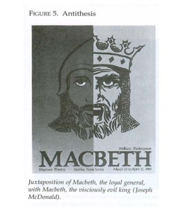
This Macbeth poster shows one verbal term in combination with two contrasting images. It is a result of an experiment by Hanno H.J. Ehses in which the heuristic possibilities of ten style figures are tried out. Students in a design class were asked to find graphic encodings for a poster that announces this Shakespearian tragedy, using the formal construction principle of a specific rhetorical figure as a guideline (Ehses 2004, p. 173).
The Macbeth poster uses shape and shade differences at either side of the vertical line to reveal two Macbeths, evoking two moments in the life of the main character in this drama. The two halves of the same face form the parallel construction, or the syntactical element the antithesis is based upon. The two sides of this poster show the younger loyal general and the older evil king he has become, introducing both a time element and the driving force of this character. The lines at the left side are in soft shades of grey, leaving one white element to stand out: the little white crescent in Macbeth’s eyes, repeated at the right side, suggesting the one element that holds this character together: the fatal ambition to become king. The picture should be read from the left to the right, the right side representing the older king in sharply contrasting black and white lines, suggesting his cruelty.
This is a single antithesis: the word Macbeth is yoked with two visual opposites. The verbal element Macbeth is supported visually by the image of the face, and the contrast is expressed only visually. The two white crescent forms in Macbeth’s eyes form a nice repetitive element within the visual antithesis. As suggested by Aristotle (and interpreted by Fahnestock), single antitheses are not suitable for building a new argument, but they can serve as a refutation (Fahnestock 2000, p. 177). Indeed, this antithesis reveals the dramatic value of the play, and shows Macbeth as a tragic hero, driven to death by his ambition. The function of this poster is to give information about the play and to invite the reader to come and see it. The antithesis works nicely: by opposing the younger and the older Macbeth, it raises the general question: how could this one man have two completely different personalities? A certain incompatibility, some kind of contrast is revealed, suggesting the tragic events in the play. The line of argument can be reconstructed as such: Come and see the play Macbeth / because it is interesting to see the dramatic evolution from the young and eager general Macbeth to the old and desperate king Macbeth.
This technique is applied in many commercials as well. The brand name is the unifying factor, the contrast is shown visually, and the underlying reasoning is something like If you drink Danone, you’ll lose weight; if you don’t, you’ll stay fat. / If you don’t drink Coca Cola, you’ll stay lonely; if you do, you’ll become popular. Those combinations are interesting for advertising, since such antitheses have a simplifying effect and make the consumer forget all about the grey middle zone of intermediate processes and positions. The combination of one word with a pair of contrasting pictures often creates a striking or funny effect: a question, a joke, a surprise, a riddle, a problem. Sometimes, the line of argument created can serve as a refutation, eg. in cartoons where the impossible combinations in the lives or characters of celebrities are dealt with and condemned. My suggestion is that the argument line of those antitheses often comes close to what Perelman and Olbrechts-Tyteca called quasi-logical arguments, where incompatibilities are presented as if they were logical contradictions. But this is definitely not always the case. In all of these examples, the conclusion is presented verbally, and the reasons visually – within the antithesis.
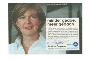
(2) Less ado, more done.
Another technique that is very widespread as well goes the other way around: in this example, the image of the politician forms the visual element, while the verbal antithesis is showing her message. Here, the repetition of the verb ‘to do’ results in a somewhat stronger effect. A similar example is a picture of a flashy car accompanied by the words: More car for less money (Figure 2). The line of argument is similar to examples one and two: the surprise effect prevails. Another example is a bit more complicated, as it shows the visual conclusion of a sad message Last year flowers, this year nothing. In this secretary’s day drama, we see the picture of a sad looking secretary, presenting the reasons of her sorrow in a verbal antithesis. In these examples, the conclusion is presented visually (vote for me / buy this car / I’m sad), and the reasons verbally – within the antithesis.
(3) Johannesburg public transport police
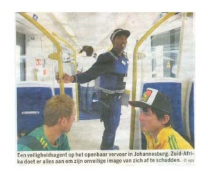
This image (Figure 3) shows a strong visual contrast with the two (white) boys and the yellow bars separating them from the aisle in the middle, where a (black) man in uniform is prominently present, keeping law and order. The verbal message at the bottom of the picture goes as such: Security officer on the public transportation in Johannesburg. South Africa is doing its utmost best to get rid of its unsafe image.
The formal contrast is visual, not verbal. One can easily understand the paradigmatic visual message of the policeman doing his job and taking the middle position between two boys. The antithesis is visual, and possibly suggests a fight that could start between the two boys. The line of argument presents a solution, visually shown by the police officer in the middle. Conclusion: The boys will not get caught in a fight. Reason 1: There is a police officer that will prevent this.
In the verbal message, two sub-arguments are added to the first reason. Reason 1.1.: South Africa has put policemen on public transport. Reason 1.1.1.: South Africa wants to get rid of its bad image. The verbal sub-arguments are used to add the actual circumstances to this paradigmatic picture. As a whole, this is a nice example of a functional visual antithesis, because it adds something to the verbal message without changing it.
(4) Chat with politicians
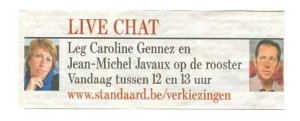
In this text (Figure 4), the verbal message that invites us to challenge both politicians is imperative, but the visual presentation suggests contrast rather than comradeship between these politicians, as it pushes them apart to the far sides of the message. The visual separation of the two politicians widens the gap between them, while in the verbal message there is no contrast between them whatsoever. Is this a functional antithesis? No, it is only a visual suggestion of opposition, a very popular technique in the media – and not only there.
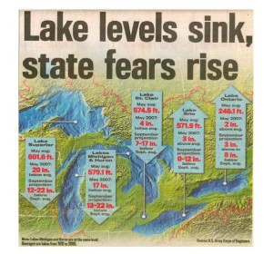
(5) Lake levels sink, state fears rise. (The Detroit News, June 12, 2007)
The verbal antithesis (Figure 5) is constructed from two pairs: sink / rise, and lake level / state fears. The two parts of the antithesis show a causal relationship. The picture is complex: it shows a photographic air view of the lake region, filled in with five up or down vectors that in their turn show data about the water level of the five lakes. The very dominant vectors suggest a repetition of the verbal sink / rise contrast, yet two out of the five vectors point upwards, which downplays the effect. After some close scrutiny, it becomes clear that the situation is not as dramatic as the title suggests. Two lakes are still above the average water level, and other low water level extremes are nowhere mentioned – only the averages.
In this case, the verbal antithesis clearly inspired its visual counterpart, but the vectors in the picture are about a different rise / sink – contrast, which results in a rather vague and confusing line of reasoning as a whole. By extending the verbal contrast to the picture without following the line of reasoning, the ‘antithesis’ has become a purely formal play and hence has lost a great deal of its function.
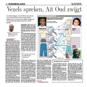
(6) Science versus Ait Oud
The next example (Figure 6) shows a catchy antithesis in the title and a vibrant and fascinating illustration. Speaking scientific evidence is put against the silence of the accused, who by this silence keeps denying the facts. Vezels spreken, Ait Oud zwijgt (Fibres talk, Ait Oud keeps silent). The double pair the antithesis is built upon consists of the obvious speaking versus keeping silent contraries on the one hand, and the fibres versus their previous owner – Ait Oud wore the clothes – on the other hand. Although the fibres talk, AO keeps silent. This clash makes the antithesis function like a paradox, stressing the frightful mystery of the accused stubbornly denying the murders. It expresses the questions the public is confronted with. As such, it does what it has to do here: it creates an opposition, a paradox, and it leaves open the question. In this case, the overwhelming scientific evidence is revealed, but the boundaries of science in the domain of jurisdiction are not being denied. This antithesis, within this context, is an example of a style choice that epitomizes an important question and stimulates public debate. Conclusion: It is unclear which source we are to believe in the case of AO. Reason: Science proves AO guilty, while AO denies his guilt.
The illustration shows a picture both of the (silent) AO, and of his clothing, with the abundantly ‘talking’ fibres. Some 20 vectors leave his garments and head for the clothes of the two raped and murdered children, at the right side of the picture. The visual effect is strong, as well as the title message of the picture: The strongest evidence against Ait Oud. This picture clearly backs the overwhelming scientific evidence of the fibre examinations: the fibres speak. The left – right opposition and the little pictures showing the faces of the three parties add to the narrative aspect of the illustration, suggesting the cruel rape and murder act of the accused (left). The illustration creates a new pair: it is the opposition between the accused AO (left side) and the two victims (right side). It can easily be considered a sub-argument for the first part of the antithesis: the fibres prove his guilt and the picture as a whole evokes his cruel deeds.
(7) The safest side in a train crash
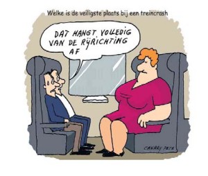
Figure 7 – Which is the safest side in a train crash? / That depends entirely on the direction of the train.
This cartoon (figure 7) starts from a (verbal) question, provides us with an enigmatic verbal answer, while the final explanation of the answer is to be found in the picture. This picture provokes a very clear and convincing antithetical line of reasoning: if the train goes to the right, the safest side is on the left (with a soft landing promised to the two gentleman, and no great injuries to the pink lady), if the train goes to the left, the safest side is on the right (with dramatic consequences for the gentlemen). Here, the visual contrast between the two tiny men on the one side of the train compartment and the big pink lady on the other side is enhanced by the line of hypothetical reasoning that is generated by the verbal message. Conclusion: The safest side in a train depends on the direction of the train (verbal) and the weight of the victims (visual). Reason: if the train goes into the direction of weighty people, it is safe; if the train goes into the direction of small people, it is unsafe. The visual adds the element of body weight to the verbal element of direction, and that is what creates the pun.
5. Conclusion
Perelman and Olbrechts Tyteca claimed that an effective figure can only be recognized as such after an analysis of its context and function. In the cases analysed, we can see that some contrasts are in the verbal, others in the visual, sometimes they repeat one another; often they need one another to reveal the full meaning. Some cases, like Macbeth (1) and Less ado, more done (2) are quite simple. Their visual impact is strong, but their functional value is often limited to a suggestion of surprise. In those cases, the reasoning is in the antithesis, no matter whether these premises are verbal or visual; and the conclusion is within the single term yoked to the contrasting pair, no matter whether this term is visual (picture of politician) or verbal (Macbeth). Sometimes, the picture can stand on its own while the verbal element adds actual information to narrow the meaning down (3 – Johannesburg)), and sometimes the visual creates an opposition that is not present in the words (4 – Chat with politicians). Example 5 (Lake levels sink, state fears rise) shows how a verbal antithesis is reduced to a formal game by an ill-chosen illustration, and in example 6 (Fibres talk, Ait Oud keeps silent) we see how one side of the verbal antithesis is supported by the illustration. Example 7 (train crash) shows quite a complex and dynamic visual antithesis embedded in verbal elements that present the conclusion.
Work on antithesis shows how form and function support and create one another, how different kinds of contrasts are made to work in argumentative moves. Both verbal and visual elements can help to construct antitheses and play their roles in it. Adding the visual to rhetorical analysis provides us more insight into the way visual and hybrid communication work, but also into rhetorical aspects of communication in general and the function of the figures in particular.
REFERENCES
Aristoteles (2004). Retorica [transl. Marc Huys], Groningen: Historische uitgeverij.
Birdsell, D.S., & Groarke, L. (2004). Toward a theory of visual argument. In C. Handa, Visual rhetoric in a digital world. A critical sourcebook (pp. 309-320), Boston / New York: Bedford / St. Martin’s.
Blair, J.A. (2004). The possibility and actuality of visual arguments. In C. Handa (Ed.), Visual rhetoric in a digital world. A critical sourcebook (pp. 344-363), Boston / New York: Bedford / St. Martin’s.
Ehses, H.H.J. (2004). Representing Macbeth: A Case Study in visual rhetoric. In C. Handa (Ed.), Visual rhetoric in a digital world. A critical sourcebook (pp. 164-176). Boston / New York: Bedford / St. Martin’s.
Fahnestock, J. (1999). Rhetorical figures in science. New York / Oxford: Oxford University Press.
Fahnestock, J. (2000). Aristotle and theories of figuration. In A.G. Gross, and A.E. Walzer, (Eds.) Rereading Aristotle’s Rhetoric (pp. 166-184, Ch.10), Carbondale: Southern Illinois University Press.
Foss, S.K. (2004). Framing the study of visual rhetoric: toward a transformation of rhetorical theory. In C.A. Hill and M. Helmers (Ed.), Defining Visual Rhetorics (pp. 303–313, Ch. 14), Mahwah, NJ / London: Lawrence Erlbaum Associates.
Goggin, M.D. (2004). Visual rhetoric in pens of steel and inks of silk: challenging the great visual/verbal divide. In C.A. Hill & M. Helmers (Ed.), Defining Visual Rhetorics (pp. 87-110), Mahwah, NJ / London: Lawrence Erlbaum Associates.
Hobbs, C.L. (2004). Learning from the past: verbal and visual literacy in early modern rhetoric and writing pedagogy. In C. Handa (Ed.), Visual rhetoric in a digital world. A critical sourcebook (pp. 55-70). Boston / New York: Bedford / St. Martin’s.
Kress, G., & Van Leeuwen, T. (2006). Reading images. The grammar of visual design. London / New York: Routledge.
Kress, G. & Van Leeuwen, T. (1998). Front pages: (The critical) analysis of newspaper layout. In A. Bell and P. Garrett (Ed.), Approaches to media discourse (pp. 186-219, Ch. 7). Oxford UK / Malden MA: Blackwell Publishers.
Olson, L. (2007). Intellectual and conceptual resources for visual rhetoric: A re-examination of scholarship since 1950. Review of Communication, 7, 1-20.
Perelman, Ch. & Olbrecht- Tyteca, L. (1969), The new rhetoric. A treatise on argumentation. [Translated by John Wilkinson and Purcell Weaver]. London / Notre Dame, University of Notre Dame Press.
