Ton Dietz ~ Working Paper: Destination Africa. The Dynamics 1990-2015
 In September 2017 the African Studies Centre Leiden published a Thematic Map about Africa’s international migration in 2015. At the backside the 2015 data published by UN-DESA were used to show the total international immigration data per country, linked to the position of these countries on the Human Development Index for the same year. Also the data for intercontinental immigration per country were given.
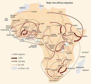
These were clearly showing that immigration was much higher for the African countries with a relatively high HDI score than for the African countries with a low HDI score. Intercontinental immigration was much lower than international immigration, because most international migrants stay within Africa. The thematic map showed that out of 20.4 million people who were stated to be ‘immigrants’ (= born in another country) only 2.5 million came from outside Africa. A map was shown with all major intra-African migration flows as measured in 2015. And two maps were included showing how many people had immigrated to the 54 African countries, and what the numbers and relative importance was of inter-continental (non-African) immigrants per country, linked to the 2015 HDI scores. So far so good. But there is much more to show.
For this preparatory note for the ‘Destination Africa’ conference we added a dynamic picture: looking at the changes between 1990 and 2015. And we also looked at the dynamics of the patterns of migration: where did the people come from who have been counted as ‘immigrants in Africa’ in 1990, 2000, and 2015. An interesting question can also be answered: what is the colonial hangover? And is it true that Europe is losing ground?
This is volume 141 of the series ASCL Working Papers.